You paid for it, you liked it, people compliment it.
In six months it has produced almost nothing. That's a specific kind of frustrating, y lo he visto mucho, because there's nothing visibly wrong to point at. If the site were ugly you'd know what to do. Instead it's fine. It loads, it looks current, the photography is good. Asking why is my website not generating leads feels almost ungrateful given how much better it is than the last one.
The answer is usually simpler and more annoying than a design critique. Across the 100+ sites I've worked on it's nearly always the same one.
So the site is finished. It was finished against the wrong brief, which is a different problem from being broken and has a different fix.
The Short Answer
When a service business site looks great and brings in nothing, it wasn't built to collect leads or to sell. It was built to look like a business, a different job it usually does well. A site that generates leads has to sort people, answer what they need in order to decide, then give them something to act on.
If You're Reading This Because It's Your Site
Reading more isn't the hard part. La Jugada is $47 and it tells you which layer this is actually sitting in.
Get it, $47The Myth: A Good-Looking Site Is a Working Site
Nobody says this outloud. Everyone acts on it.
The reasoning goes: a professional site signals a professional business, a professional business gets taken seriously, being taken seriously produces clients. Every step of that is true enough to keep you from questioning the chain. What it skips is the part where someone does something, which is the actual purpose of a website.
Stanford's web credibility guidelines note that people quickly judge a site's credibility by its visual design alone. Nielsen Norman Group's work on communicating trustworthiness puts it plainly. A professional appearance feels solid and clear navigation reads as respect. Real trust builds slowly, through what happens next. Design doesn't decide whether there's anything to do once they're convinced. Those are separate systems built by separate decisions. A site can score full marks on the first while never having been asked the second question at all.
This is why a redesign that only changes the look so rarely fixes it. You take a site that looks like a business and rebuild it to look like a better business. Sale el mismo resultado, con mejor tipografía.
What "Built to Look Like a Business" Looks Like
Every fan site in 2003 had a signature gif, a hit counter and a guestbook. Gorgeous. Somebody's whole weekend went into the layout, con ganas. Almost none of them had a way for you to join anything, so you looked, you admired it and you left. Mira, read your own site as a stranger and that same pattern shows up fast.
Every page is a description. The services page describes your services, the about page describes you, the homepage describes the whole thing in miniature. All of it accurate, all of it well-written, none of it asking the reader to do anything or helping them work out whether they're in the right place.
The contact page is the only place where something can happen. It's a form with three fields and no context: name, email, tell us about your project. That form is doing the entire job of converting interest into a conversation, on its own, at the end of a user experience nobody designed to convert.
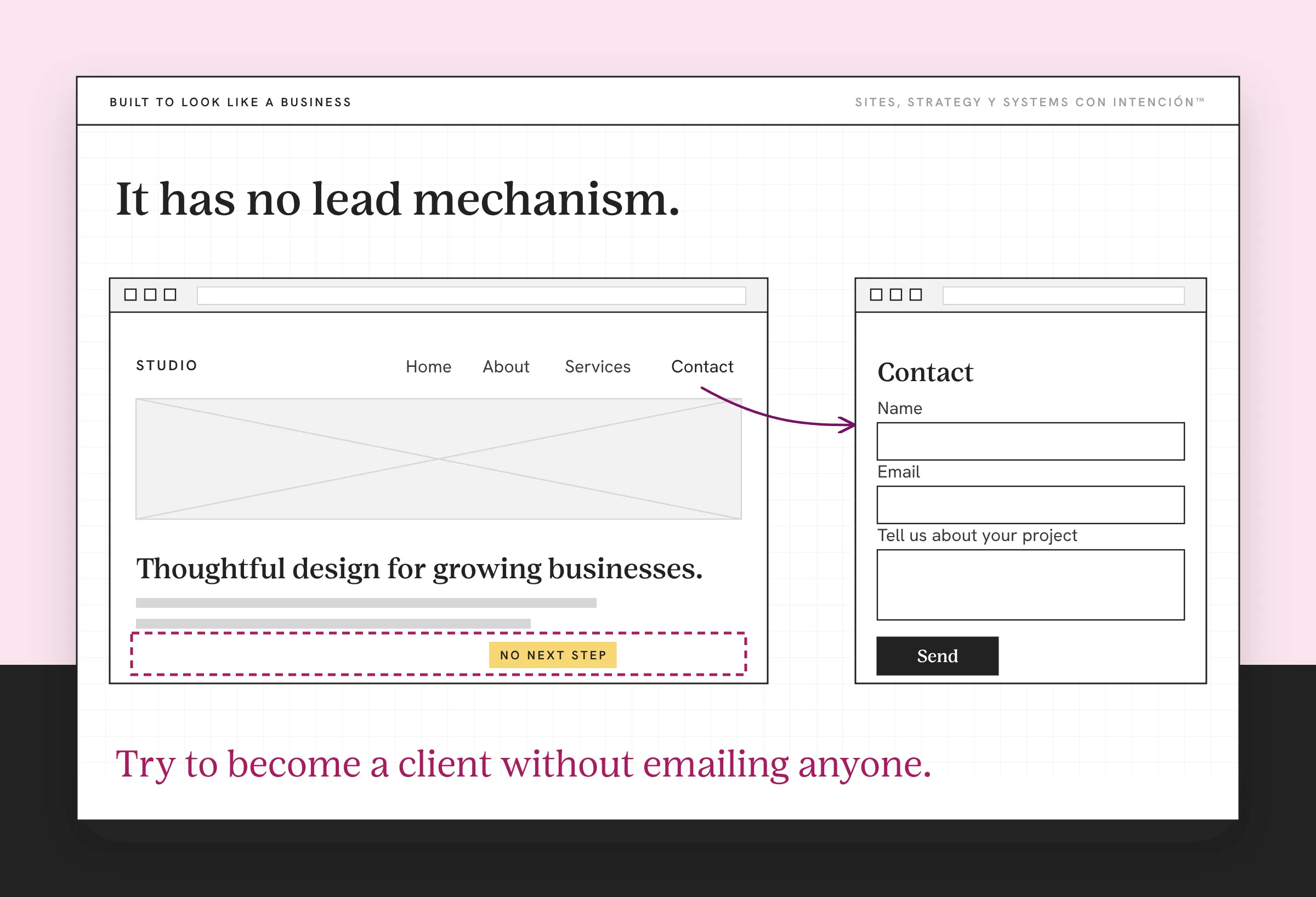
The clearest version of this I've worked on was a contact form on a contact page. That was the whole mechanism. The form wasn't broken and it wasn't buried and it wasn't ugly. It worked. Somebody filled it out every so often. Y ese es el problema. Because the site had a contact page, everybody involved believed it had a way to convert, so nobody looked at it again, let alone gave the website a performance review.
What that meant in practice: every interested person had to decide to go find the contact page, then decide to write a message to a stranger, then wait. Anyone not ready for all three left no trace at all, just traffic that never converted. The owner was the one closing that gap by hand, every time, as the salesperson her website should have been. She was also the only part of the system that could.
Meanwhile the things that would move someone are missing. Y nada de eso está ahí. There's no way to tell which service is theirs. No indication of what happens after they write. Nothing about cost. Nothing about shape. No sense of whether they're too early for you. Nothing that tells them what working with your service business involves before they have to ask a stranger. That's what website strategy for a service business is for.
A site like that has no lead problem. It has no lead mechanism.
Why Does This Happen to Good Businesses With Good Taste?
In the sites I've worked on, it's almost never carelessness. Three reasons, every one of them reasonable at the time.
The brief was visual, so the output was visual. You hired for design and you got design. Nobody asked which decisions a visitor needs to make, in what order, because the user experience wasn't the assignment. Designers build what is briefed.
The site was built when the conversation was the product. Early on, every lead came from a referral or a conversation, so the site only had to confirm you were real. It did that. Then the business grew past word of mouth and the site was never re-briefed for its new job as a working business asset.
Describing is easier than deciding. Writing what you do is straightforward. Deciding who your site should turn away, which service leads, what someone should do at minute two versus minute ten: that's strategy. It's uncomfortable because every answer excludes someone. So the site stays descriptive. Website messaging that sounds like your business without ever committing to who it's for is the most common version of this.
The Test That Settles It in About a Minute
Open your site on your phone and notice whether it's mobile friendly. Start at the homepage. Try to become a client without emailing anyone.

Can you tell which service is yours? Can you find out what it involves, roughly what it costs, what the first step looks like? Is there anything to do at the moment you decide, other than composing an email from scratch?
If you got stuck, that's where your leads are getting stuck. Aquí es donde se nota, on your own phone, in under a minute, without any analytics at all.
Most people doing this for the first time find the same thing: the site is a closed loop. Every path leads back to reading more about you. The only exit is a high-friction form that asks them to explain themselves to someone they haven't met.
What Does a Site Built to Generate Leads Do Differently?
It's less about adding things and more about the site having been asked a second question.
It sorts. A visitor can tell within a screen or two which service is theirs, without choice overload slowing them down. Or that none of them are, which is just as useful. One client site I worked on looked fine and still lost people on the services page, which the numbers made obvious. Once that page was fixed, more of them moved on to the next step. It sequences: what they meet at minute one is different from what they meet at minute six, because their readiness is different at each stage of the conversion funnel. It answers the questions that currently arrive by email, which is what turns a first conversation from an interview into a decision.
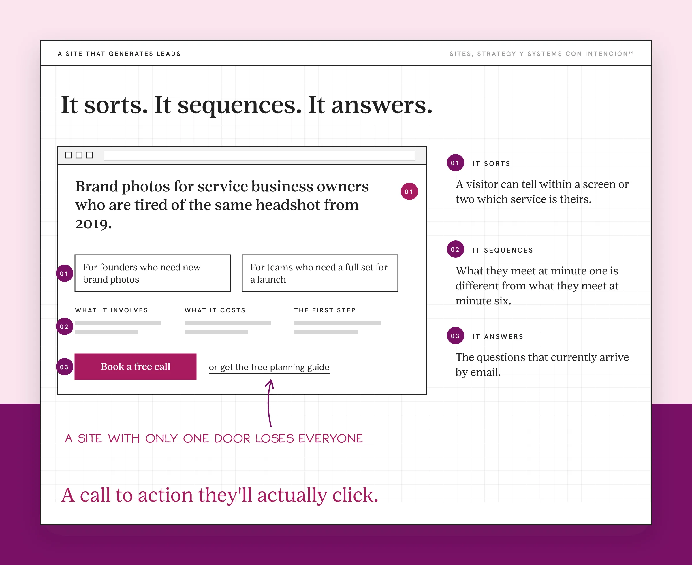
And it gives them a call to action they'll actually click, one that's smaller than "book a call with a stranger." Plenty of visitors who aren't ready for a call are ready for something that costs them less and tells them something useful. A site with only one door loses everyone who isn't ready to walk through that particular one.
If you want the specific moves rather than the diagnosis, the prescriptive version is 8 ways to turn website visitors into leads. This post is about why it's happening. That one is about what to change.
When Is It Not This?
Two honest exceptions, because "your site was built wrong" isn't always the answer.
Sometimes the site is fine and nobody is arriving. A site can't convert visitors it doesn't have. No amount of structural work fixes a traffic problem. If your analytics show very few people reaching you at all, that's a findability problem and it comes first. Start with Google's SEO Starter Guide.
Sometimes the site describes a business you no longer run. That's a different failure with the same symptom: the site is working exactly as built and what it was built for has expired. The fix for an outdated website is content.
There's a third that's rarer than people think, at least in the sites I see: the design really is the problem. It happens. It's just much less common than the invoice for a redesign would suggest.
Where Does Each Piece of This Go Deeper?
Every part of this diagnosis has its own post. If you aren't sure your numbers are even low, start with what a normal conversion rate looks like for a service business. If a page asks for too much before anyone can act, that's the cognitive load of a crowded page. If people get close to the ask and still don't reach out, look at the trust signals that sit beside it. Each of those is one piece of the same website strategy puzzle.
If you're tempted to fix this with more ads or more posts, read why more marketing won't fix a bad website first. Your content can bring people to the site, but the site still has to close the sale. If every small change waits on a developer, the build itself might be a website that needs constant updates. And when you're ready to put a number on what the site returns, the website ROI breakdown walks through the math.
Key Takeaways
- A site that looks great and generates nothing usually wasn't built to collect leads or sell. It was built to look like a business, which is a different job.
- Design helps decide whether people find you credible at first glance. It doesn't decide whether there's anything to do once they're convinced.
- The tell is that every page describes and only the contact form asks, so the form is doing the whole conversion job alone.
- Test it on your phone in a minute: try to become your own client without emailing anyone.
- A redesign rebuilds the same brief more attractively, which is why it so rarely changes the numbers.
My site looks great. So where is it losing people?
Answer a few questions about your site, your content and your backend in La Digital Rueda. It's free and takes about two minutes and you'll see where the pressure is.
And if you'd rather have this kind of thing turn up in your inbox, Off the Clock is where I write about building something that keeps working while you aren't at your desk.
Frequently Asked Questions
Why is my website not generating leads even though it looks good?
Because looking good and generating leads are different jobs. Most service sites were only briefed for the first one. A good-looking site earns enough trust for someone to keep reading. To generate leads it also has to sort people, answer the questions that decide it and offer a next step that matches how ready the visitor is. Your site can do the first perfectly and never have been asked to do the second.
How do I know if it's my website or my traffic?
Check whether anyone is arriving. If analytics show very few visitors, you have a findability problem and no structural change will fix it. If people are arriving, spending time and leaving without doing anything, the site is the constraint. Those two problems look identical from the outside and have completely different fixes.
Will a redesign fix it?
Usually not on its own, because a redesign rebuilds against the same brief. If nobody asked which decisions a visitor needs to make and in what order, the new site will describe your business more attractively and convert about the same. The brief is the thing to change. Sometimes that means a rebuild and often it doesn't.
What should my website have that it probably doesn't?
It needs a way for someone to tell which service is theirs, an honest sense of what working together involves and roughly what it costs, answers to the questions that currently land in your inbox and a next step smaller than booking a call with a stranger. Most sites have none of those and one contact form doing all of it.
How long does it take to see a difference?
Structural changes tend to show up faster than people expect, because you aren't waiting on rankings, you're changing what happens to the traffic you already have. If your visitor numbers are steady, a genuine change in what the site asks people to do shows up in inquiry quality within weeks rather than months.
Is a contact form enough?
For someone already sold, yes. For everyone else it asks too much: compose a message, explain your situation, send it to a stranger, wait. That's a lot to ask of a person who is still deciding. It's why a site with a single contact form as its only action converts the people who were always going to reach out and nobody else.
About the Author