Week one in the Big Brother house, nobody makes a big move. Everyone's watching who talks to who, who's sleeping in which room and who seems a little too eager. The houseguest who walks up on day two and says "let's be final two" goes home first. Everyone else waits until they know who they can trust.
Your call to action is that houseguest. If you've been wondering why people don't click call to action buttons on your site, start with what you're asking them to commit to and how soon. In 12+ years and 100+ sites worked on, when a CTA isn't getting clicks I look at what the visitor knows about you by the time they reach it.
The Short Answer
People don't click a call to action when the ask doesn't match where they are. They aren't ready, don't trust you yet, fear a sales call or can't tell what the button gets them. Fix it with a step that fits how ready they are, a line about what happens after the click and a button that names the result.
If You're Reading This Because It's Your Site
Reading more isn't the hard part. La Jugada is $47 and it tells you which layer this is actually sitting in.
Get it, $47Why Don't People Click on Calls to Action?
Every CTA asks for a decision. Clicking "Book a Call" means giving up time and maybe money. It also means admitting to a stranger that something in their business isn't working. Before anyone clicks, they weigh what the click costs them against what they know about you so far.
When the cost feels bigger than the trust, they don't click. They scroll, they leave, they follow you on Instagram and they tell themselves they'll come back when they're ready. Ay Dios mío, some of them follow you for a long while before they do.
None of that shows up as a reason in your analytics. You just see a page with traffic that doesn't convert, a CTA nobody touches and a conversion rate that won't move. The reason lives in the visitor's head, so that's where we're going.
What's Going On in Their Head When They Don't Click?
Four things come up when I look at CTAs that aren't getting clicks. They're different problems with different fixes, so it helps to know which one you're dealing with.
They're Not Ready Yet
Someone who just realized their site might be the problem isn't ready to hire a strategist. They're still figuring out what's wrong. A CTA that asks them to book a call is asking for a decision they haven't reached yet.
That's a visitor at a different stage of the funnel than the one your button was written for. Mija, they'll get there. Your page just has to give them something to do in the meantime.
They Don't Trust You Yet
Trust gets built on the page before the button. Nielsen Norman Group's guide to trustworthy design breaks down how. If the CTA shows up before you've said who you help, how you work or what changed for someone like them, you're asking for the final two deal on day two.
This is where most of the work happens and it has very little to do with the button. Clear copy, a specific offer, proof that works as a trust signal and a brand that feels consistent all count. If your page talks about you and never about them, the CTA is carrying weight the copy should have carried, corazón.
They're Scared of a Sales Call
"Book a call" can sound like "get pitched for 30 minutes." People have sat through those calls before. Qué susto, the last thing they want is to be cornered into buying something they're not sure about.
If your CTA is a call, that fear comes from experience. The fix is to tell them what the call actually is, how long it takes and that nobody's going to pressure them.
The Button Says Nothing
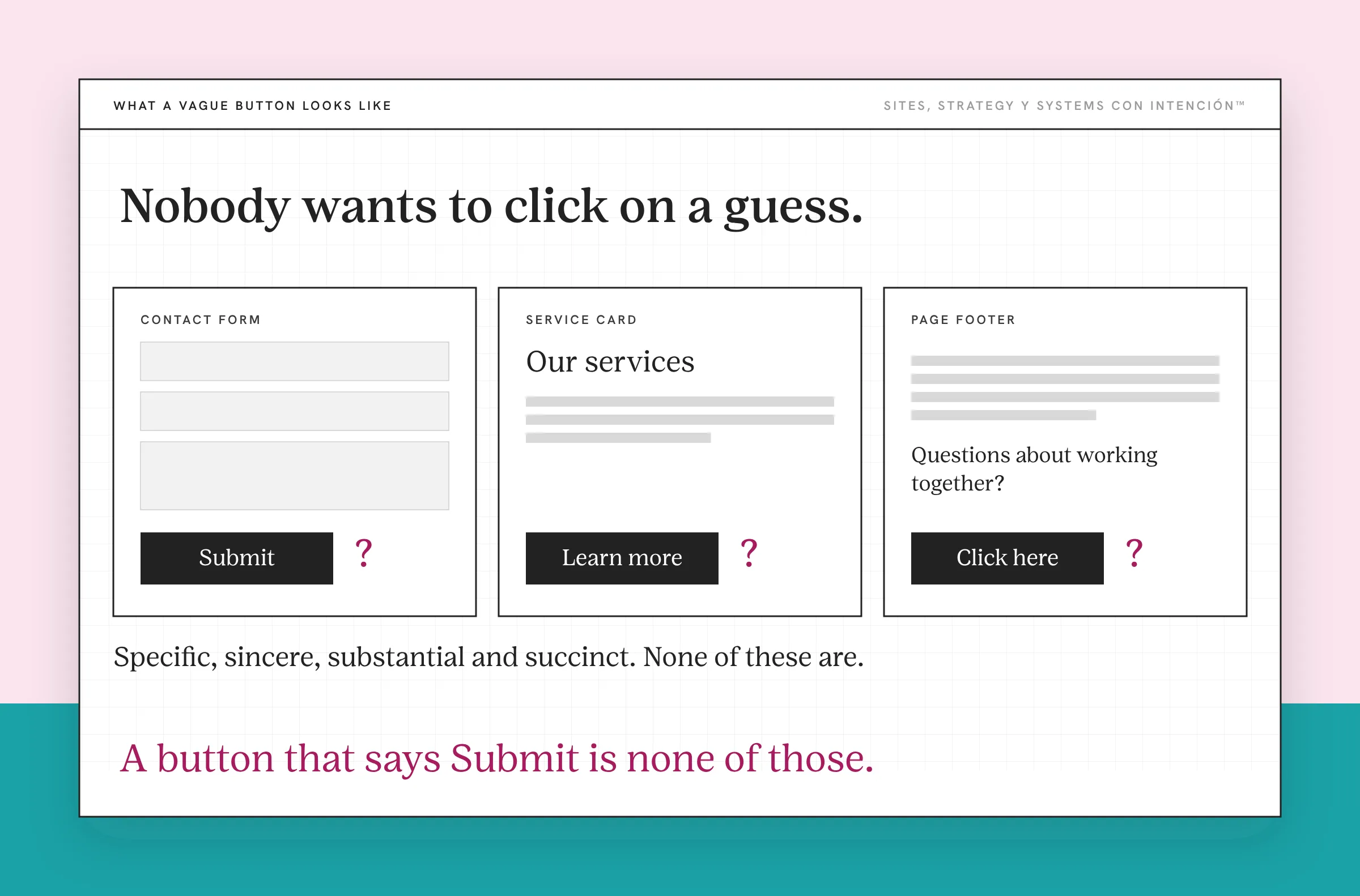
"Learn more," "Submit" and "Click here" tell someone nothing about what happens next. Nielsen Norman Group's guidance on writing better link labels says labels should be specific, sincere, substantial and succinct. A button that says "Submit" is none of those.
When the button says nothing, the visitor has to guess, o sea, they have to do your job for you. Nobody wants to click on a guess, te lo juro.
What Do People Say When They Finally Reach Out?
Two things I hear from people who finally reach out tell you a lot about why they waited.
The first is "I've been following you for a while." They were reading the whole time. They saw the posts, they read the emails and they visited the site. They didn't click because nothing on the page gave them a step that matched where they were. So they watched and waited until they felt ready for the big one.
The second is "I didn't know if I was ready." Bendito, that one gets me every time. They thought they had to have everything figured out before they were allowed to reach out. The CTA asked for a decision and they didn't feel qualified to make it. Nena, you don't need to be ready to ask a question. But if your page never says that, they don't know it.
Both of those people wanted to work with you. The CTA just asked for more than they could give at that moment.
How Do You Get People to Click Your CTA?
Unless people can't find the button, you don't need a brighter one. You need an ask that fits the person reading it. Three changes do most of the work.
Match the ask to how ready they are. Not everyone on your site is ready to book. Give the people who aren't a smaller step that turns them into leads, like a free assessment, a newsletter or a guide that helps them figure out what's wrong. They stay connected to you while they get ready for the bigger step. Keep your main CTA for the people who are ready and let your smaller CTAs serve everyone else.
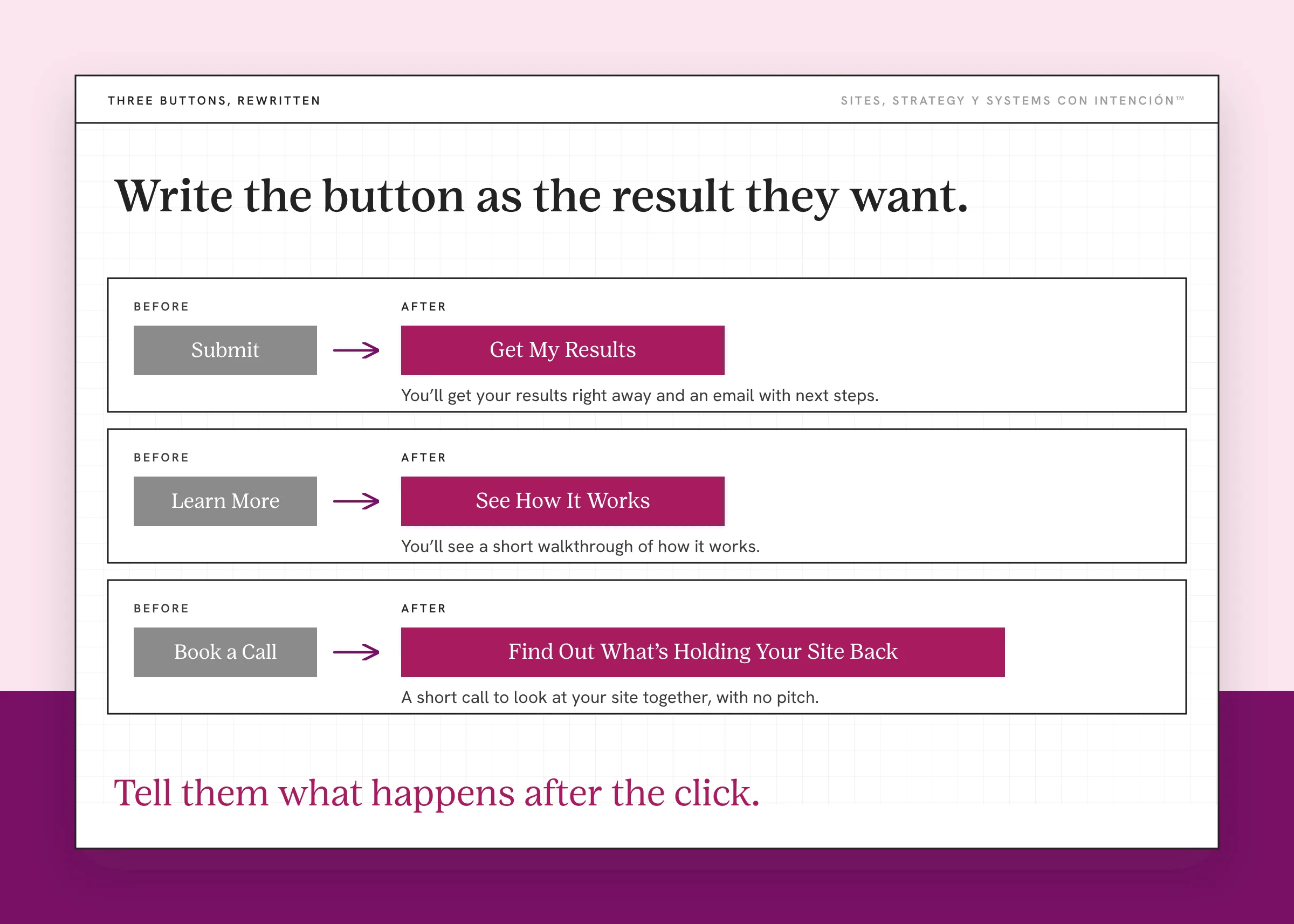
Tell them what happens after the click. Right under or next to the button, say what happens after the click. Something like "A short call to look at your site together, with no pitch." Or "You'll get your results right away and an email with next steps." When the unknown goes away, so does most of the fear. Créeme, one sentence here does more than a redesign of the button.
Write the button as the result they want. Swap "Submit" for "Get My Results." Swap "Learn More" for "See How It Works." Swap "Book a Call" for "Find Out What's Holding Your Site Back." The CTA button should name what they get, in the words your target audience would use. Nielsen Norman Group's point that a link is a promise is why it matters: the label sets an expectation and the page it opens has to keep it.
Where the button sits and how many CTAs you use matter too. That's its own topic: call to action placement and how many asks is too many. If your pages have several competing buttons, choice overload and cognitive load are probably part of the problem as well. Fewer, clearer asks is a pattern you'll see across my website strategy.
What to Do This Week
- Read your main CTA as a first-time visitor. Ask yourself what it costs them to click and what they know about you by then.
- Add one sentence under your button. Say exactly what happens after the click.
- Rewrite one button. Replace "Submit," "Learn More" or "Click Here" with the result they get.
- Add a smaller step. Give people who aren't ready to book something useful to do instead.
If your site has a CTA but no clear path to it, start with what happens when a website has no clear next step. And if people visit but never inquire at all, the bigger picture lives in why a site that looks great still doesn't generate leads.
Key Takeaways
- People don't click a CTA when the ask feels bigger than the trust they have in you.
- The four usual reasons are that they're not ready, they don't trust you yet, they're scared of a sales call or the button says nothing.
- People who finally reach out often say they've been following for a while or didn't know if they were ready.
- Match the ask to how ready they are, say what happens after the click and write the button as the result they want.
Why isn't anyone clicking my button? Where do I start?
Start with La Digital Rueda. It's free and takes about two minutes. It asks a few questions about your site, your content and your backend and shows you where the pressure is.
Want more like this in your inbox? Off the Clock is my week-ish newsletter about websites, systems and burnout-free business.
Frequently Asked Questions
Why is nobody clicking my CTA?
The ask probably doesn't match where the visitor is. They may not be ready to buy, may not trust you yet or may worry that clicking leads to a sales pitch. A vague button like "Learn More" or "Submit" makes it worse because it doesn't say what they get. Check what the page tells them before the button and what the button promises.
How can unclear wording make people ignore a call to action?
Unclear wording forces people to guess what happens after the click. Words like "Submit" or "Click Here" don't describe a result, so the click feels risky. Specific wording that names the outcome, like "Get My Results," tells them exactly what they're agreeing to. That makes the decision smaller and easier to say yes to.
Do too many calls to action discourage clicks?
Yes, they can. When a page asks someone to book a call, join a newsletter, download a guide and follow you on social all at once, each button competes with the others. Comparing options takes effort and many people choose nothing. Give each page or landing page one main CTA and keep any secondary step clearly smaller.
How long should a call to action be?
The button itself should be short, just a few words that name the result. You can add a sentence under it that explains what happens next, like how long a call takes or when they'll hear back. Short buttons with a clear line of support beat long buttons that try to say everything.
What is a good example of a call to action?
A good CTA names the result and fits how ready the visitor is. "Get My Free Website Assessment" works for someone still figuring out the problem. "Book Your Strategy Session" works for someone ready to talk. Add one line under it about what happens next and you've answered the question they have before they click.
About the Author