A Zapier zap either runs clean or it flags the step that broke. Zapier won't call a run successful because most of it worked. Mira, a website is the opposite and that's the problem. You have the pages. Homepage, about, services, contact, probably a blog and maybe a resources section.
The site exists. It's presentable. People land on it and still can't work out what to do, which feels like a content problem and is a sequencing one. Having the right information on a site is a different achievement from having a path through it. Most service businesses have done the first without doing the second.
Across 100+ sites in 12+ years, the place I find this most often is the stretch between interested and ready, well before anyone gets near the contact page.
The Short Answer
When a website has no clear next step, the pages are all there. What is missing is the thread between them. A visitor can read the whole site, understand the work, want it and still not know what to do about it. Nothing in the structure moved them toward one action.
If You're Reading This Because It's Your Site
Reading more isn't the hard part. La Jugada is $47 and it tells you which layer this is actually sitting in.
Get it, $47What Does No Clear Next Step Look Like?
It's recognizable from outside the business and almost invisible from inside it.
Their version of it: too many steps to convert, too easy to get off track, no clear way to take action. The pages hold accurate information about real work. Y nada empuja. Nothing pulls them from I just landed here toward I'm ready to reach out.
There's a name for what they're using to make that decision. Nielsen Norman Group calls it information scent: at every step they're making a rough guess about how likely a page is to have their answer and how long getting there will take. When the scent is weak they don't dig around. They leave.
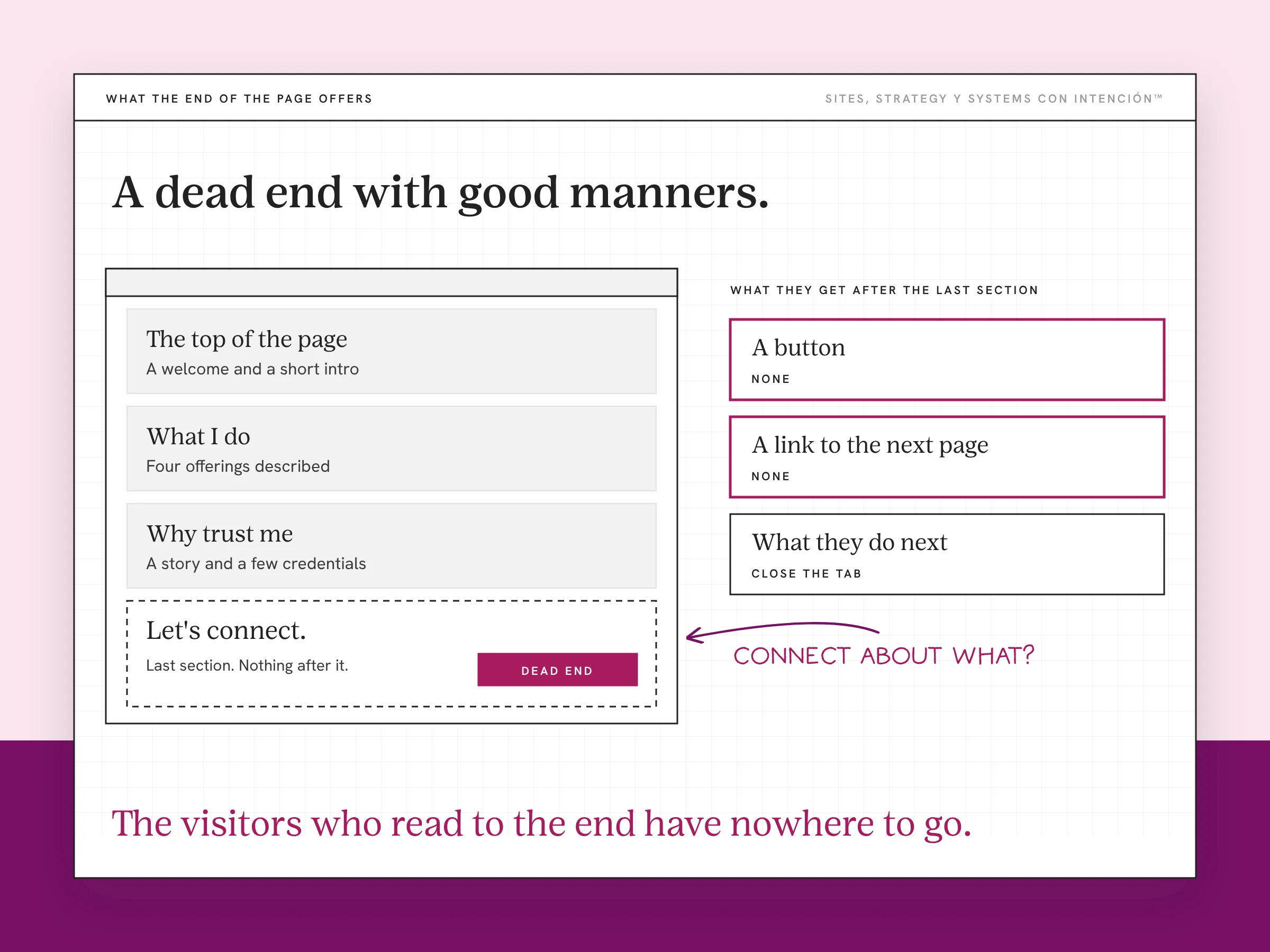
It shows up in specific shapes. A services page that describes four offerings without telling them which one is theirs, which is where visitors become clients. A homepage that introduces you well and never says what to do once they're interested. An about page that earns real trust and ends in nothing. Each page is defensible. Es que the set of them has no direction.
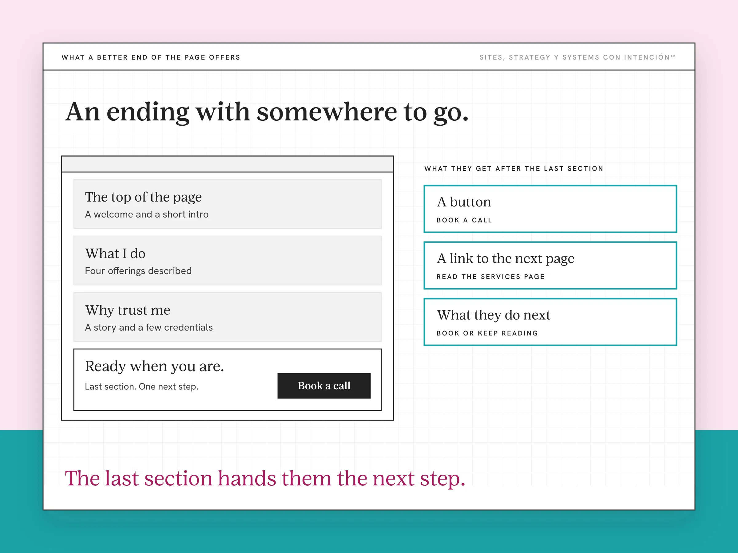
So they read, they nod and they close the tab without ever deciding against you, because there was never a moment built where a decision could happen.
Why Is This So Hard to See From the Inside?
You've never arrived at your own site cold.
You know which page holds the pricing conversation. The services page is the one that matters and you know it. You know what the button at the bottom does before you read it. Every one of those is knowledge they don't have. Every one of them makes the path look complete to you. It's a version of what Nielsen Norman Group calls the false-consensus effect: assuming other people share your beliefs and will behave the way you would.
The other reason is that this failure is silent. They don't tell you the site was confusing. Nobody writes in to say the thread ran out. You get no inquiry and no complaint, which looks exactly like nobody visiting. That's why sites sit in this state for years while the owner looks for the problem in the copy.
What Does a Path Actually Need?
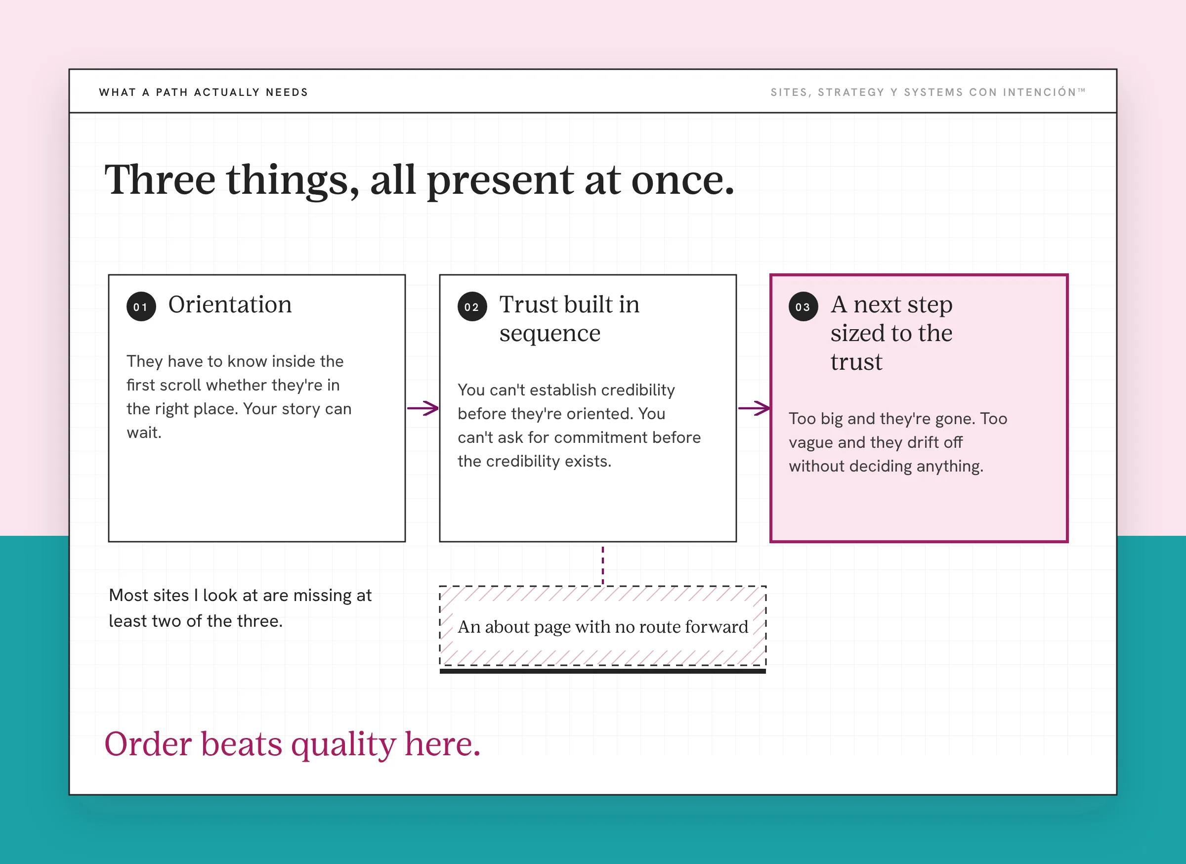
Three things, all present at once, in this order.
Orientation. They have to know inside the first scroll whether they're in the right place. Your story can wait. This is the job your homepage is doing or failing to do. It comes down to what's on your homepage.
Trust built in sequence. The information has to arrive in an order that works. You can't establish credibility before they're oriented. You can't ask for commitment before the credibility exists. Reversing either one leaves a page that's accurate and unpersuasive.
A next step sized to the trust the page has earned. The ask has to match where they are. Too big and they're gone, así de rápido. Too vague and they drift off without deciding anything.
Most sites I look at are missing at least two of the three. The content for each stage usually exists somewhere on the site. That's what makes this feel like a small problem, right up until you try to trace the route.
Order beats quality here. A services page they never reach is doing no work at all. An about page that builds trust and offers no route forward is a dead end with good manners. Strong pages in the wrong sequence are still a structural failure.
Where the Path Runs Out
The gap is between I'm interested and I know what to do next.
They've read enough to want more. What the site offers them at that moment is one of two things. An ask too large for the trust built so far, usually a full discovery call before they understand the offer. Or an invitation so vague it asks nothing. Let's connect. Connect about what?
They looked interested right up until the moment there was nothing sized for them to do. Y ahí es where it ends, undramatically.
This is why the people not converting are usually not the indecisive ones. They're the ones who ran out of road. Visitors who don't convert are mostly telling you something about the structure rather than about themselves.
One client's site looked fine. The numbers showed people leaving on the services page, which is exactly that stretch between interested and ready. After the fix, more people moved on to the next step.
Make the Consequence of the Click Obvious
A next step only works if they know what it does before they take it.
Clear doesn't mean the action and it doesn't mean the outcome. It means the consequence. They should know before clicking whether the button fills in a form, picks a time, takes payment or loads a page. That one test rules out most of what sits on service sites: Learn More, Get Started, Submit. Nielsen Norman Group has a whole piece on the problem with "Learn More" links.
The other half is quantity. Every time I've cut a page down to a single decision point, that one change outperformed everything else on the list combined. No percentage attached to that, because it's a pattern across a lot of sites. Two equal asks side by side hand them a decision about your website instead of a decision about your work. Where the call to action goes and how many there are is its own piece of work.
What Changes When the Path Exists?
Three things can change: more leads, more conversions and cleaner inquiries. None of them is guaranteed. Which ones show up depends on what was broken.
The cleaner part is the one worth understanding, because it's the one people don't expect. The people who reach out already get it. They've been guided through the right information in the right order. By the time they contact you they're partway to a decision.
That's the path doing the work the first half of a discovery call used to do. No figures attached to any of this. It's what I see happen.
The Fix Is Usually Reordering
When the pages are already there, you rarely need to write more or increase how many pages the site has. Reordering what's already there solves more website strategy problems than people expect.
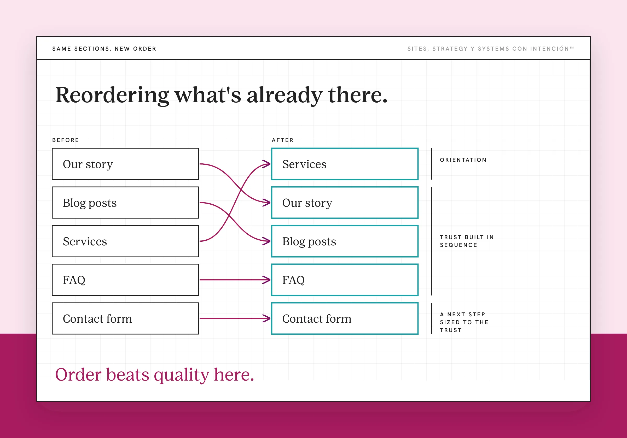
What most sites need is the existing material sequenced against the route a stranger takes. That means deciding the order before touching the pages. That's planning the structure when the site is new. When it isn't, the job is organizing the content that's already there.
Then the sequence has to survive contact with the menu. Navigation order decides whether they ever reach the page you sequenced so carefully. Sales and landing pages drop the menu on purpose, because each sales or landing page holds one decision. And the page where the decision happens has to be built for a decision rather than for a description, which is structuring for conversions.
Two things this isn't. If the words on each page describe instead of helping someone choose, a working path gets them to the same undecided place faster. That's a copy problem. If they stall inside a page rather than between them, that's a different diagnosis: a user experience problem.
Key Takeaways
- When a website has no clear next step, the pages are almost always present. The thread between them is what is missing.
- A path needs three things at once: orientation, trust built in sequence, then a next step sized to the trust already earned.
- Most sites break in the middle, between interested and ready, rather than on the contact page.
- The failure is silent. No inquiry and no complaint looks identical to no traffic, which is why it goes unfixed for years.
- The fix is usually reordering what the site already has.
Okay, so where does my site stop telling people what's next?
La Digital Rueda is free and takes about two minutes. You answer a few questions about your site, your content and your backend and it shows you where the pressure is.
And if you'd rather have this sort of thing arrive in your inbox, Off the Clock is where I write about building something that keeps working while you aren't at your desk.
Frequently Asked Questions
What does it mean when a website has no clear next step?
That the pages exist without a route through them. A visitor can read everything, understand the work and still have no obvious action available at the moment they want one. It's a sequencing failure. That's why adding another page or rewriting the headline rarely changes anything.
Why do visitors leave a website without taking action?
Usually because the site ran out of road before they got to a decision. The ask was either too large for the trust the page had built or too vague to act on. Occasionally they were never the right visitor. Far more often they were interested and the structure never built them a moment to decide in.
What is the difference between website pages and a website path?
Pages hold information. A path is the order they're meant to be read in and the route between them. You can have every correct page and no path, which is the most common version of this problem. You can't have a working path without the pages, so the pages come first and almost everybody stops there.
How do I know if my website has a clear path?
Trace it yourself as a stranger with one specific problem. Start on the homepage, take only the actions the site offers you, then stop the moment you have to go backwards or guess. Wherever you stop is where your visitors stop. What makes this hard to run honestly is the instinct to use what you already know.
Should every page have a call to action?
Every page should have one obvious next move that suits where the reader is on that page. That isn't the same as putting the same ask everywhere. A blog post and a services page sit at different distances from a decision. An identical button on both is wrong on at least one of them.
Will adding more pages fix a website with no clear next step?
Not when the pages your route needs are already there. Then it usually makes things worse, because more pages means more places to get off track and more scent to follow in the wrong direction. The real work is reordering what you already have. Add new pages once the route is decided and something it needs is missing.
About the Author