By Kristine Gonzalez, website strategist, 12+ years across sites, strategy y systems
You have already typed some version of it into a search bar: my website doesn't reflect my brand anymore. Most service founders carry that one around for months before saying it outloud to anybody.
Nothing is on fire. Clients still come in through referrals and DMs and people who already know your work. Then someone asks for your link and something tightens. You send it anyway while you're already pulling it up on your own phone to check that it still loads right on mobile. Just in case.
That half second before you hand it over is the tell.
What people say next varies. What they mean never does. The version I hear most often is this: "I'd rather just give them my Instagram." Es que that one gets heard as avoidance. It's closer to a status report. You're telling them where the current version of your business lives.
The Short Answer
When your website doesn't reflect your brand, the site is usually describing an older version of your business because the newer version got built somewhere else. The offers you're proudest of were made on Instagram, sold through a checkout link and never turned into a page. The site didn't fall behind. It was never invited forward.
If You're Reading This Because It's Your Site
Reading more isn't the hard part. La Jugada is $47 and it tells you which layer this is actually sitting in.
Get it, $47Why Doesn't My Website Reflect My Brand Anymore?
The first assumption I hear is usually cosmetic. The layout is dated. The fonts feel like someone else. There's a headshot up there from a haircut you've moved on from.
Some of that's probably true. It's also the least interesting thing about the problem.
Sometimes the design really is the problem and a designer fixes it. When I look underneath the complaint, what I usually find is harder to solve with fonts. The site was built to impress rather than to guide, so it collects compliments and produces nothing. Or it's carrying the origin story and the portfolio and every offer at the same volume, with no hierarchy telling a stranger where to look first. Neither of those is a font problem. Both survive a redesign that only changes the look.
Your site is the first thing a stranger meets. Nielsen Norman Group put a number on how little of it they read: across 45,000 page views, an average visit leaves time for 28% of the words on a page at the absolute outside. Twenty percent is the likelier figure. So the site has to answer who you are, what you do and whether this is for them, using about a fifth of the words you wrote. A site can clear every visual bar and still answer none of them. You feel that mismatch every single time you paste the link.
Where Did the Gap Come From?
I read other people's websites for fun. Not as a service. As a hobby, the way some people do crosswords. It's the nuyorican thing of listening for which version of somebody you're getting, because there's always more than one. The place I usually go first is the navigation and the way the site asks you to move through it, because that's where the seams show first.
Do that often enough and one pattern keeps turning up. The offer someone is actively selling right now doesn't exist on their website.
I watched someone sell intensives for months entirely on Instagram. There was no page for them, no line in the nav and nothing on the site to click. If you had not been following them that season, there was no way to know the thing existed.
It got built on Instagram. It got sold with a checkout link. ThriveCart or Stripe or whatever was fastest that week. It worked, money came in and real people bought. That isn't a mistake and I'm not going to pretend it is.
But the offer never became a page. No URL. No headline. No spot in the navigation and no paragraph explaining who it's for.
Think about how an artist rolls out a new era. New visuals, new site, new photos, new everything, all at once and on purpose, because the rebuild is the announcement. Nobody drops a new sound and leaves the old album art up.
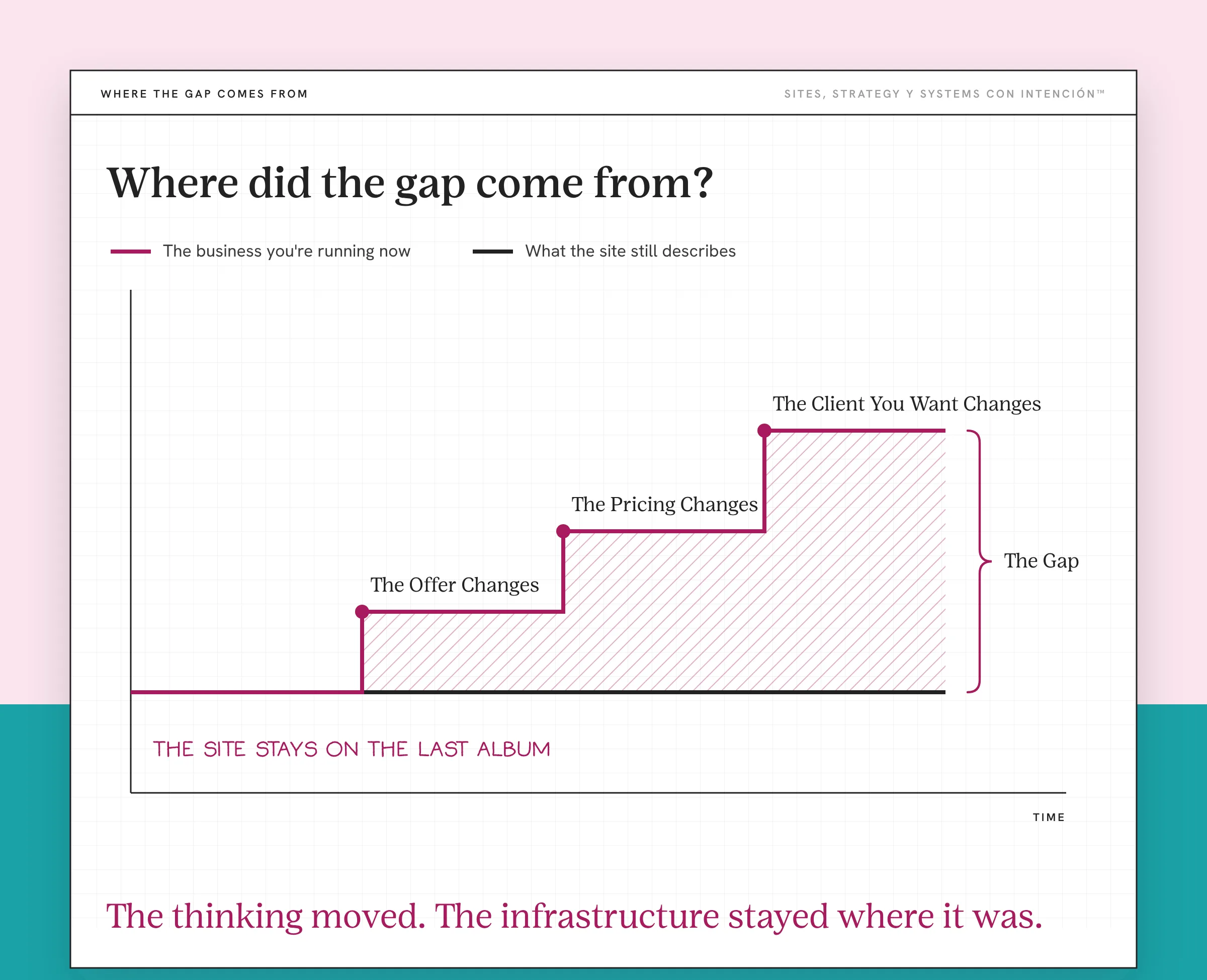
Founders get new eras too. We just never announce them. The offer changes, the pricing changes, the client you want changes. The site stays on the last album.
So the website keeps describing the business you were running the last time you had a free weekend to redesign the site, sin darte cuenta. The business you're running now lives inside a link in your social media bio. That's the gap: the Strategy-to-System Split™, if you want the name for it. The thinking moved and the infrastructure stayed where it was.
It shows up on the site the same way structural burnout shows up in a calendar or the backend that hasn't kept up shows up in a workflow. One reasonable workaround at a time, each one defensible on the day you made it.
How Do I Tell If My Website Has Fallen Behind?
You can check this yourself in about five minutes and you don't need anyone's help to do it.
Open your Instagram on one screen and your website on the other. Write down what each one is selling. We don't care about the vibe for this exercise, though the two should be reflecting each other on that too. What we want here is the actual offers, with names and prices where you have them.
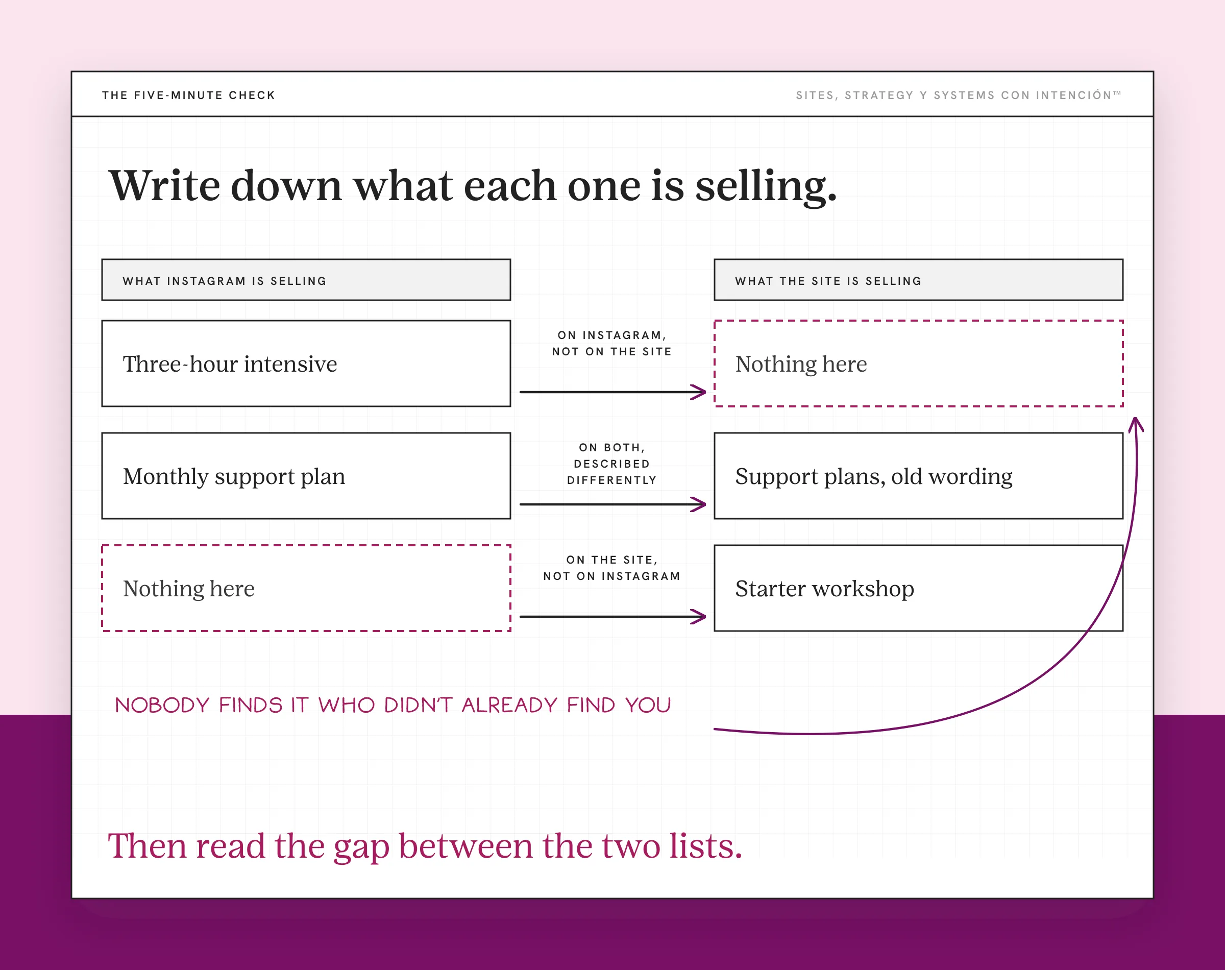
Then read the gap between the two lists.
- On Instagram but not on the site. Often this is a newer offer that never made it onto the site. It has no page, so nobody finds it who didn't already find you.
- On the site but not on Instagram. You stopped selling this and the site is still pitching it. That can pull in inquiries for work you have already moved away from.
- On both, described differently. Your positioning moved. The site is running the old language, which means the messaging it should already be using is still sitting in your drafts or your DMs.
Two smaller tells worth checking while you're in there. When was anything on the site last updated, honestly. Stanford's web credibility guidelines say to update content often. And how many clicks does it take a stranger to reach the thing you most want to sell.
If that count keeps climbing, treat it as a signal rather than a verdict. It usually points at the conversion gap between what you're selling and what your site is built to hand someone.
What Does It Cost to Keep Selling Off the Site?
Nothing, on the day you do it. Y ahí es donde it gets expensive, because nothing is a very easy price to keep paying.
A checkout link converts the people who already found you. A page earns the people who haven't. You've been doing the first one well enough that the second one never became urgent.
The cost shows up as a route you don't have. An offer with a real page can be found through search, linked to, quoted in someone else's article and found at eleven at night by a stranger who has never heard your name. An offer that lives in a bio link can be bought by people already in the room. Both are worth having. Right now you're running one and calling it a website.
From the buyer's side it looks like this. You either DM and hope they answer or you hope they bring it up in stories. I DM'd a salon once because their own page told me to DM with questions about services. They never wrote back. I was ready to book and they still don't know I existed.
That's also why this reads as a brand problem when it's closer to an outdated website that holds a version of the business you've outgrown where the current one should be. And it's how a website starts hurting the business: it becomes the ceiling the business keeps hitting instead of the thing that lifts it.
Do I Need a Redesign or Does the Site Just Need to Catch Up?
When the pages are right and what's on them is out of date, you need the catch-up. Mira, I'll say that plainly because the cheaper answer is easy to miss once you're already shopping for a redesign.

A redesign changes how the site looks, works and is organized. If what is wrong is that three of your offers are missing and the copy is running language you retired last spring, a redesign that doesn't touch the content hands all of that back to you in a nicer typeface. You'll be embarrassed by it again before long, which is the part nobody warns you about.
What usually closes the gap is smaller than a rebuild:
- Give each offer you sell its own page when it has a different audience, scope or set of questions
- Update the language to how you describe the work now, outloud, on calls
- Take down what you stopped selling
- Put the thing you most want to sell where someone can reach it in one move
That's a catch-up. A rebuild is a different purchase. Getting that distinction right early is a big deal in website strategy.
I didn't follow my own advice here because of the dividing line. A catch-up fixes content: stale offers, missing pages, language you retired two client types ago. It can't fix architecture. Mine was wrong. The pages had stopped matching how the business worked. The design was still showing a previous version of it. Updating the copy inside those pages was never going to land.
That's the test. If the pages are right and what sits on them is old, catch up. If the pages themselves are wrong, you're buying a rebuild whether you call it one or not. Worth knowing when a visual update isn't enough before you spend the money.
Get a structural website audit first. A serious rebuild should change more than the surface. What you're paying to reconsider in a rebuild is usually the structure underneath. If your structure is fine and only the content is stale, you're about to pay full redesign prices for a haircut.
There's a version of this where the site isn't even as bad as you think. You haven't looked at it carefully in months. You're arguing with a memory of your own homepage.
What Changes When the Site Catches Up?
The hesitation goes first.
The site isn't perfect. It finally says what you already know about your work. De verdad, that turns out to be the part that mattered. You send the link with no preface because you're not embarrassed by your website anymore. No "ignore the homepage." No apology attached like a receipt.
What changes underneath is the part worth wanting. You stop being the translation layer. Right now the referral works because you're in the room: someone asks what you do and you answer, so the site is never tested. That channel runs at the speed of your own attention. It's a good channel. It's also the only one you have while the site is still describing the old business.
And the site starts doing the job it was hired for, which is holding the version of your business you already grew into. You stop being the only one who can explain it. That's the whole point of building this stuff con intención: we want it working while we are off the clock instead of waiting on us to narrate it.
Key Takeaways
- A website that doesn't reflect your brand is usually describing an older version of your business.
- The gap normally comes from routing: newer offers got built on Instagram and sold by checkout link, so they never became pages.
- You can find it in five minutes by listing what Instagram sells next to what the website sells and reading the difference.
- Selling off-site keeps the sale and gives up the route. A checkout link converts people who already found you. A page earns the ones who haven't.
- The fix is usually a catch-up: pages for current offers, current language, remove what you retired.
My site doesn't feel like my business anymore. Where do I start?
La Digital Rueda asks a few questions about your site, your content and your backend and shows you where the pressure is. That tells you whether the site is the whole gap or one piece of it. It's free and takes about two minutes.
Want more like this in your inbox? Off the Clock is my week-ish newsletter about websites, systems and burnout-free business.
Frequently Asked Questions
Why does my website not reflect my brand anymore?
Because your business moved and the site didn't get the update. Most often the newest offers were built and sold somewhere else, usually Instagram plus a checkout link, so they never became pages on your own site. The website keeps accurately describing the business you were running when you last had time to work on it.
What if my offers are the same and the site still feels wrong?
Then the mismatch is positioning. The offers are identical on paper and the person you built them for isn't. You raised your prices, you got choosier about fit, you stopped taking the entry-level version without announcing it. The site is still speaking to the client you were willing to take three years ago, which is exactly why the wrong people keep finding it useful and the right ones keep bouncing.
Do I need a website redesign if my site feels off brand?
Usually not. A redesign changes the presentation. If the real issue is missing pages and retired language, a redesign returns the same problem in a better-looking package. Get specific about what's missing before you budget for a rebuild.
Why does my website feel wrong even though I built it myself?
Because the person who built it had different offers, a different client and different words for the work. It may have been exactly right on launch day. If the business has grown or pivoted since, the site is now introducing someone who no longer exists.
Is it a problem to sell offers only through a link in my bio?
It isn't a mistake and it converts. It's incomplete. A checkout link works for people who already found you. A page can be searched, linked and found by people who haven't. Selling off-site only means you have one route where you could have two.
About the Author